Data Explorer
The data explorer can be used to visualize and explore data streams that are persisted by using the Data Lake sink.
It provides a canvas (i.e. a data view) where various visualizations from multiple pipelines can be placed. For each data view, you can set a date and time range for the configured visualizations.
Using the data explorer
Get the data
In the data explorer, any pipeline that uses the so-called Data Lake sink can be explored in the data explorer. Switch to the pipeline editor and add the data lake sink to a data processor or stream. The sink requires an index name as a configuration parameter, which is used as an identifier in the data explorer.
Data Views & Widgets
After your data is stored in the data lake, you can switch over to the data-explorer tab to create a novel data view and the widgets of your choice. In StreamPipes, a data view organizes a set of related widgets (i.e. data visualizations or plots) and gets assigned a single date and time range. The standard date and time range consists of the last 15 minutes of the current date and time. You can select predefined ranges (e.g. day or month) or configure the exact date and time range you want to explore.
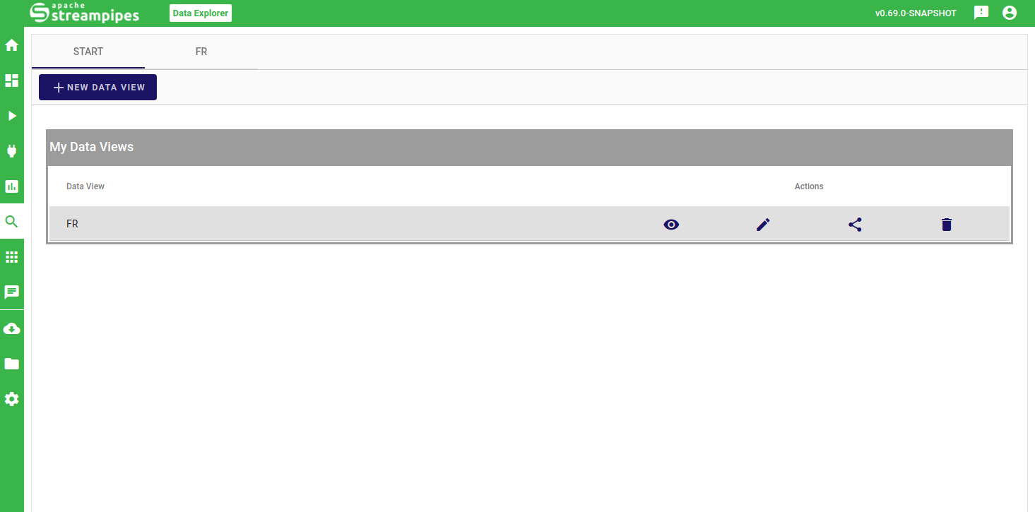
First create and name your data view and select the edit icon to proceed. In your data view, you can now add a new widget congiguration (plus icon) to configure and create your first widget. The widget configuration consists of (i) data, where the individual data sources in the data lake are selected, the properties for the widget are chosen and filters on the data sources are defined and applied, (ii) visualization, where the type of widget is chosen and the respective configuration for the widget type is done and (iii) appearance, where general style configurations for the widget (such as background color) can be performed.
Data Configuration
The data configuration is the first step to define your widget. You can add several data sources (i.e. data sinks) and need to configure each added data source individually. This gives you sufficient freedom to combine the needed information, potentially consisting of different data resolutions, filters or types of information.
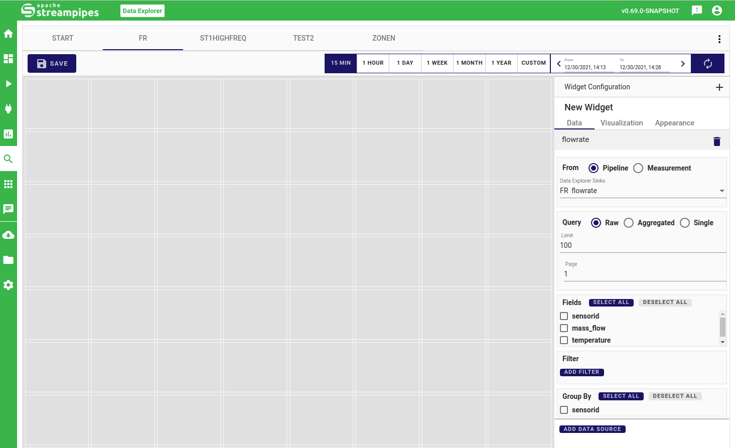
After selecting the initial data source, you can choose if the underlying data query is to be performed raw, aggregated or single. Raw queries refer to using the data as-is, where you can define a limit on the number of events to guarantee performant usage in the application. In aggregated mode, you can choose among predefined aggregation granularites (e.g. day, minute, second).
In the next step, you can choose the fields (i.e. properties of your data source) you are interested in exploring. If you selected aggregation or single mode, you can also modify the type of aggregation to be performed on the selected property.
You can also filter your data source by adding conjunctive conditions.
Visualization Configuration
The visualization configuration is dependent on the visulization type, which needs to be selected first. The data-explorer currently supports the following types:
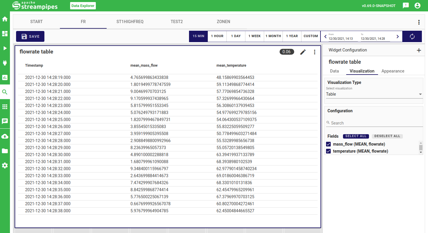
Table
The table view formats the selected properties in table format.
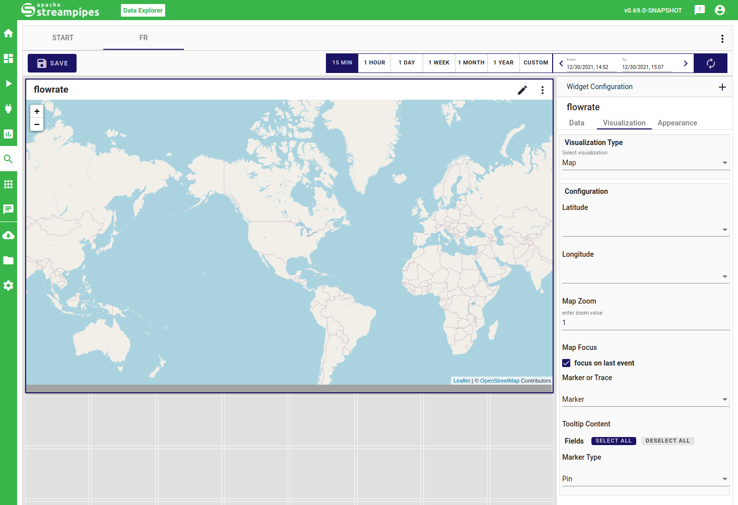
Map
The map allows to visualize and explore coordinates on the world map. The configuration requires to choose the property which comprises the coordinates, allows to choose the marker style, a zoom level as well as the tooltip content.
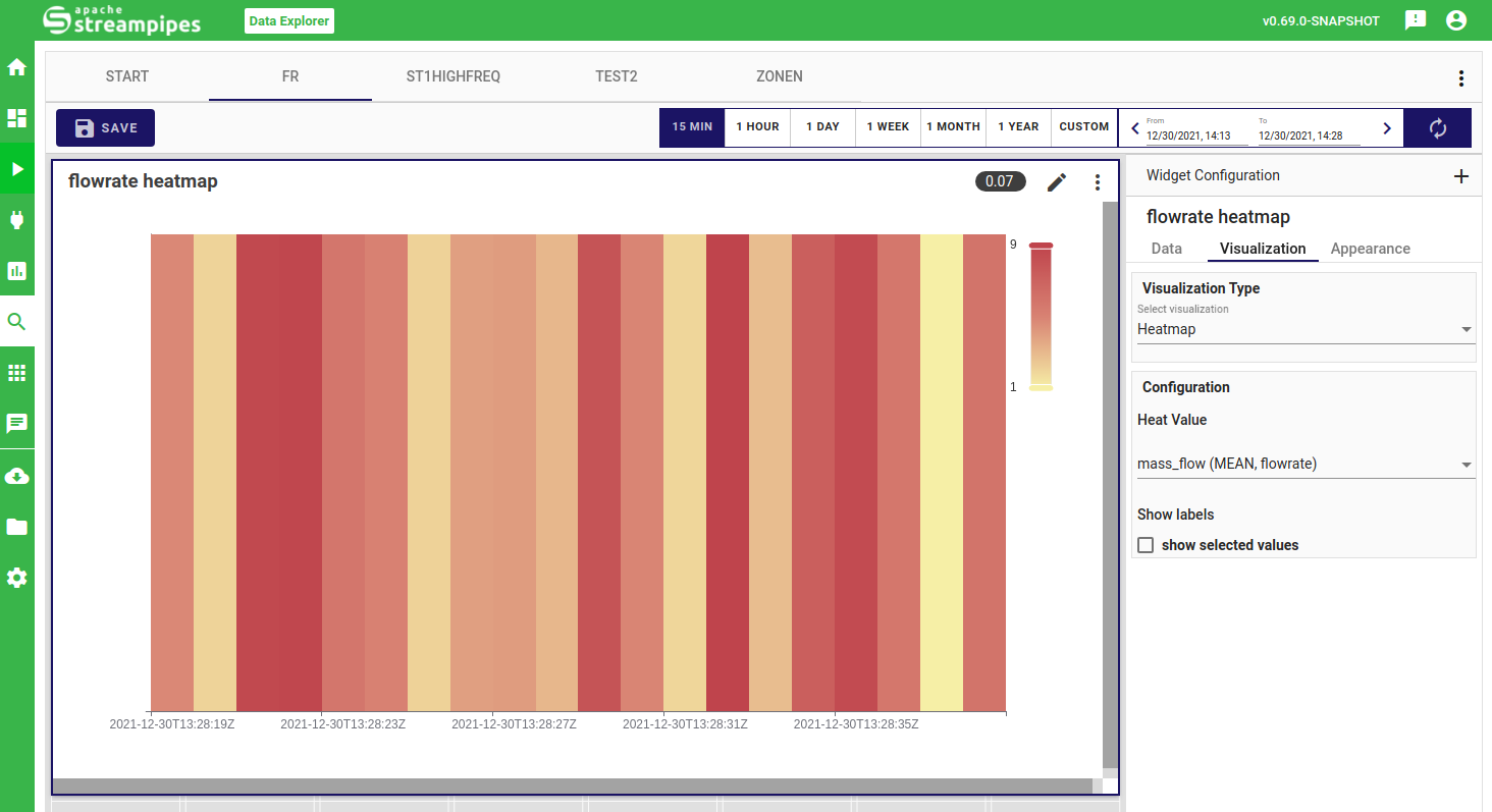
Heatmap
The heatmap widget visualizes data in terms of the available intensity, where higher values are interpreted as being more intense. You only need to select the property which you want to visualize. Note that it might be interesting to aggregate the data in the data configuration to get more insights in your heatmap.
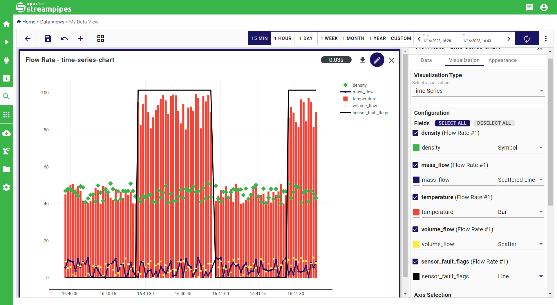
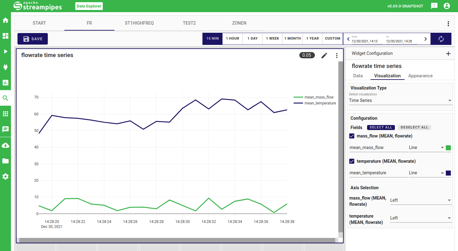
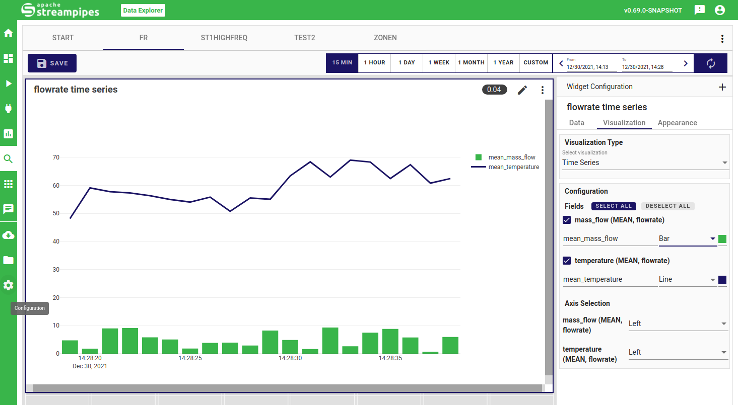
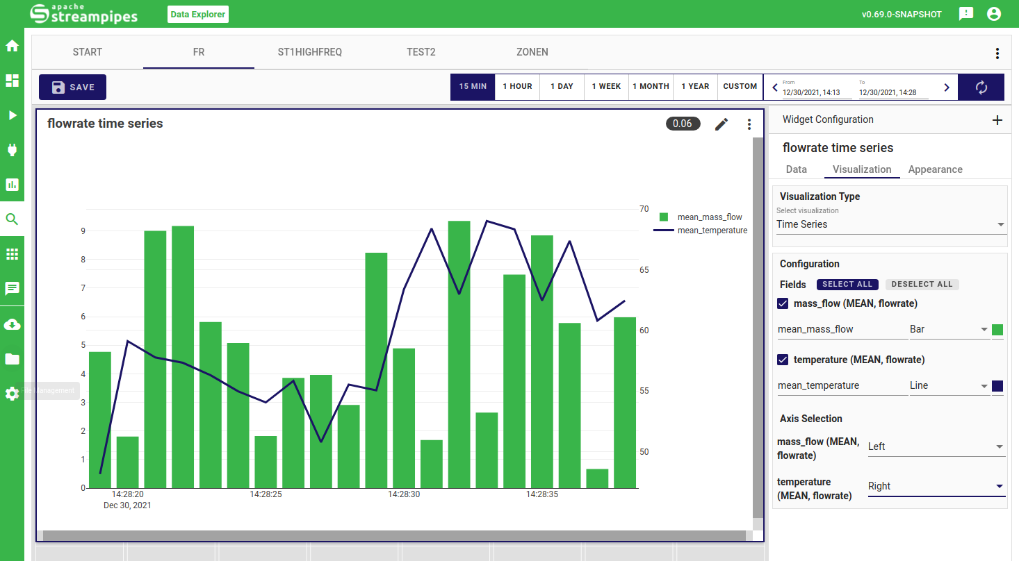
Time Series
The time series widget allows you to do exploration and analysis for your numerical and boolean data properties. You can easily visualize your data properties in various styles (i.e. scatter, line, scattered line, bar or symbol) and colors, and configure a second y-axis for better interpretation of varying property ranges.
Image
The image widget enables to integrate and visualize your image data.
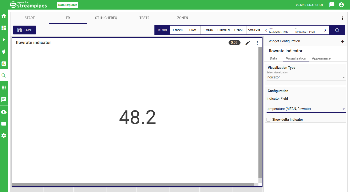
Indicator
The indiator widget lets you visualize a single numerical value as well as (optionally) the delta to another indicator. You only need to configure the respective properties.
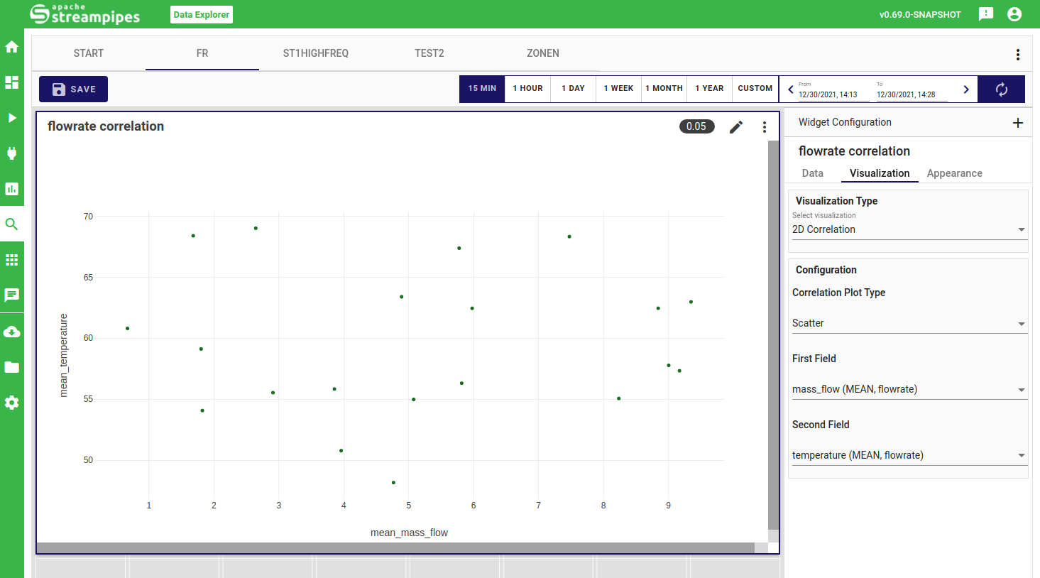
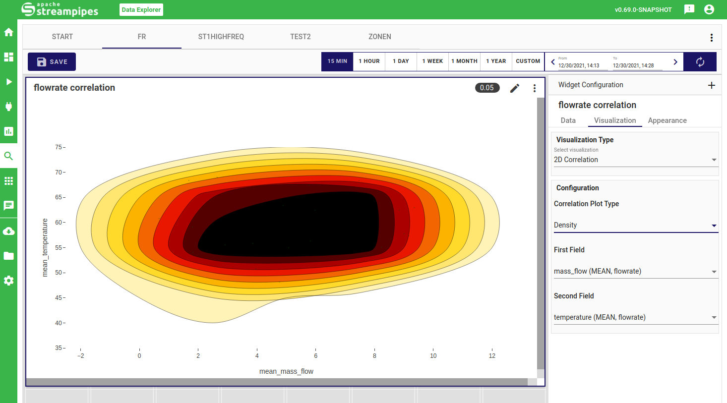
2D Correlation
The correlation plot currently supports analyzing the relationship of two properties. Once selected, you can choose between a scatter view of the plotted data points or directly extract correlations in a density chart.
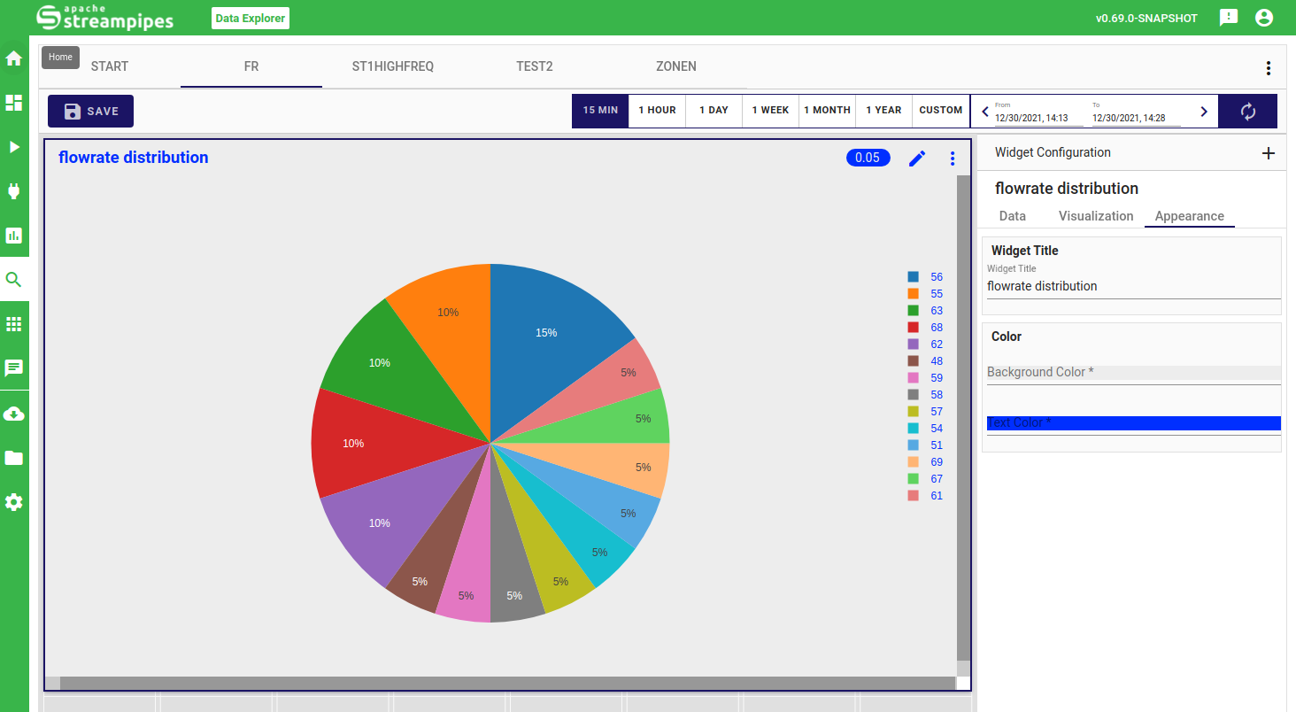
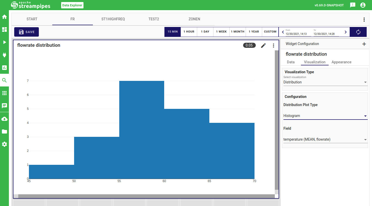
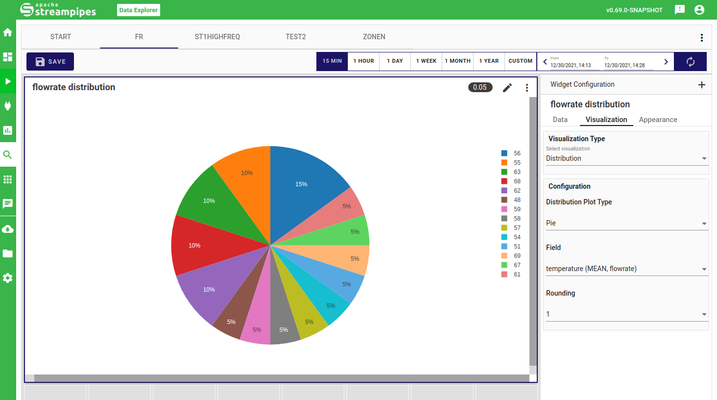
Distribution
In the distribution widget, you can quickly get an overview of your data range and common data values. You can either choose a histrogram view, where a bar chart is used to show data the frequency of automatically extracted data ranges or a pie view, where you can also select the granularity of how your data is clustered in terms of frequency.
Appearance Configuration
Finally, you can change the title of your created widget as well as background and text colors in the appearance configuration.